Thursday, March 31, 2011

New Graphic Circles+Curves Template

Hello there! I created a brand new template today which is very much "graphic" with fun circles which I love!! I wanted a fun page where I could have the photos really stand out with a graphic feel to it. Here is a preview to the digital template!


Here is a link to the digital layered template. First review how to use clipping masks here if you need to.

http://www.4shared.com/photo/jaWoPZbY/pc_graphic_circlescurves_templ.html


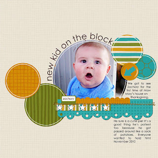
Lastly, here is an example of a traditional page I created with it. You can use it as a sketch to make your paper layouts! :)


I hope you enjoy this template!!


Wednesday, March 30, 2011

Designer Showcase: No squares (except photos)

Hey everyone :) I have a challenge for you today! Have you completed a layout yet that has no squares or rectangles with the exception of the actual 12" by 12" background shape and photos? To make it even harder have you completed a page with no squares or rectangles, not even on background and photos? I suggest you try it, it is kinds fun ;) Here are some examples of this by the contributors. If you feel like participating, send me your page(s) to scrappingpam73@yahoo.com.

First up is two great examples of this by Dolores! She used lots of fun circles and swirlies on her first page and kept the photo as the main focus!  On her second page, rather than square edges, she chose a cool curvy border along with more fun circles. Two fabulous examples!


Vicky created a beautiful page no squares/rectangles except for the background! How did she do this? She cut out a place for her beautiful photo and frayed the edges of the paper! Even the very back layer is frayed and not square. So cool!


Heather cutest this totally cute page using lots of color and circles. She used a playful scalloped border to enhance her page. Notice that Heather used a circle rather than square photo!  Check this out ;)


Nancy created three amazing pages with only photos, photo mat, and background as the square items! I love how creative she got with each layout, she was definitely "thinking outside of the box." Check out these layouts and see how she did it! Notice the bracket shape, lots of flowers, circles, and interesting borders ...


Lisa made this gorgeous floral and lace page which shows you how to using lots of shapes together (other than squares) can really make your page pop! Check out the detailing work on Lisa's page and that adorable tree on the top!


Last but not least, here is a page by Sara! She created this beautiful page using lots of shapes together! She also used lots of colors, which makes for a pretty color array on her page and really makes that photo stand out! Check out her layout.


How about you, are you ready to step outside of all boxes?


Tuesday, March 29, 2011

Reader's Pages!!

Happy Tuesday! I have a bunch of great reader's page to share! I am excited to share all of these projects that were sent to me! Inspired by something you saw on this blog? Send me your image at scrappingpam73@yahoo.com and I will feature it.

On to our first reader's page which is by Alia! She was inspired by my Ruffled Scalloped Digital Paper Pleat template. You can see the template here. I love how she used the template as a sketch for her page and created her beautiful take on her non-digital page! She used ruffles, buttons, and pearls to enhance her page, so neat!  Don't forget to visit Alia's blog for more fantabulous ideas here.  Here is her page!


Next up is two beautiful pages by Mitra!! Her first page is a take on my Scallop Circle Page Template. You can see the original post and template here. I love how Mitra made the page her own by add the journaling banner and title on an angle! check out her page!

 
On her second page, Mitra used inspiration from a post by Vicky called Vintage Style Flower Tutorial!  She created this beautiful page with lots of flowers and pretty techniques! I the delicate look to this page! Take a peek at her page below! :)   Also don't forget to visit Mitra's blog for so much more cool stuff!


Next, we have a beautiful page with button by Hannah! She sent her page to me after the designer showcase post about buttons which you can read here.  Look at how beautifully she used buttons on her page! I am loving the whole square of them in random colors! Wow! You can see more of Hannah's pretty work here on her blog!!


Lastly, we have another button page by Pascal! Check out how Pascal used the button up and down the lace on this beautiful layout! Such a great design and so eye catching! Love the layout on an angle as well ;)


~~~~~~~~~~~~~~~~~~~~~~~~~~~~~~


Thank you to Alia, Mitra, Hannah and Pascal for sending in your wonderful pages!!


Monday, March 28, 2011

Digi Tip March 2011: Open Files and Change Canvas Size using Short cuts!

Hi everyone! Time for another monthly digi tip.  I've been so busy lately. I love it when I can find things that help me get my work done, but save time. so I thought it would be a good idea to share some Photoshop short cuts.

The first short cut I'm going to share is how to easily add canvas to your image.
I started with an image that is 1200x1200 pixels
I filled the image with black just to make it easier to see.  
Now to add canvas just use the crop tool. Drag out a crop area and release the mouse.  As in the image above.

Now drag the crop handles outside of the image area as shown in the image above.

When it is the size that you want, apply the crop and you've just increased your canvas size! You can see that my canvas is now 2400x2400. The added area will be transparent if your bottom layer is a layer, rather than a background. To convert it from Background to layer, simply double click on the word Background in the Layers Palette.

Here's another short cut you can use when you need to open multiple files and would like them all in one document. 

From the menu select File > Scripts > Load files into Stack. The above dialogue box will open. Click Browse and select all the files that you want opened and you will see them listed.
 When you click OK, all of the files will be opened and each will be placed on a separate layer.

I hope you find these short cuts helpful.  Happy Scrapping!


Friday, March 25, 2011

Friday Featured Artist: Color Mixing w/ Different Mediums by Christine H.

Happy Friday and hope you day is great!! Are you ready for another talented artist? I am sharing a returning artist, Christine, who was featured back on September 17. You can read her really cool post about masking here.  Christine also has this fabulous blog called Scrapbooking Techniques where she shares lots of other super cool techniques such as distressing, creating mini-albums and her scrapbook pages! Make sure you head over there to check out her blog!!  Let's get to her neat post today and color mixing and learn some COOL stuff today!

Color Mixing with Different Mediums by Christine H.

Happy Friday! Hi! My name is Christine, and I am completely addicted to paper crafting. I was introduced to the hobby in Middle School, about 15 years ago. Within in the past few years I have found stamping and inking and have fell head over heals! I have been bloging for about 2 years and my little blog has just started to grow... I love sharing techniques and inspiring others to create!

I am so excited to be back as a featured guest on Ideas for Scrapbookers! Today I want to share some techniques on color mixing. I was thinking about how my scrapbooking budget has been decreased slowly over this past year and how I can make my supplies last longer and work for me more. I can’t always buy every color that a product comes in… even though I may want every color! So I started playing and discovered what neat effects you can create by mixing colors using different mediums.
Example:
Faded Jeans Distress Ink + Viva Pink Glimmer Mist = Purplish Stamped Image!

Below is a card that I did using the above combination.


STEPS TO ACHIEVE THIS:
1. Rub your Distress Ink onto your craft mat.
2. Mist lightly with your Glimmer Mist.
3. Stamp your stamp into your mix like it was a stamp pad.
4. Stamp in desired place.
It is that easy!

I used Tim Holtz’s new stamp collections… (this is where my scrapping allowance went!), “Papillion” & “Reflections”. As soon as I saw the Reflections stamps the idea for this card came! I love that they are backwards in order to do reverse type techniques, but on my card I just stamped as is, which is backwards. It becomes a fun twist on a “Thinking about You” card.

I made my card a pocket so the “inside” of the card is actually a tag that slides out…


There are a lot more different ways you can mix colors. Here are a few my playing yielded:


(from the left)
The first is the combination that I did on my card. The second is actually three different mediums, which created a very pretty multi colored look. Some spots are the original colors and the others are where the colors blended. The third was really fun! I used the Snow Cap Paint Dabber to “ink” up my stamp. I then sprayed the Coffee Shop Glimmer Mist directly onto the paint and then stamped my image. The last is colored Gesso. I was able to get a very textured stamped image using Gesso and it doesn’t have to be white!

Think of the color possibilities using this technique! You can get so many colors from just using a handful of supplies! I urge you to play and see what fun color combos you can create!

*NOTE*
When using Paint or Gesso with your stamps you want to clean them immediately! You do not want these products drying onto your stamps. I used water and a stamp scrubby pad to clean mine.


~~~~~~~~~~~~~~~~~~~~~~~~~~~~~~~~


Thanks so much Christine for sharing another great technique with us!! :)


Thursday, March 24, 2011

Mini Album Ideas

Today I wanted to share a few 'different' mini album ideas with you.  Mini albums are great to capture memories of a trip or an event but there are many other things to do with mini albums.

First up is a mini album I created for my 29th birthday entitled '29 Notes For Me'. This album was created to keep track of 29 things I wanted to do when I turned 29! I altered a note book to create the album. I decorated the cover and added some coordinating paper to the pages and it was ready for me to add my photos!


The second album is titled "Time Flys When Your In Love" and I used a collection of photos of my husband and I since started dating in high school up to current.  This is one of my favorite albums because it showcases a wide time frame but it hold some fun facts about us.


I hope these inspire you to start a new mini album project!

Wednesday, March 23, 2011

Designer Showcase: Monochromatic!

Have you created a layout with a monochromatic color palette? We did a designer showcase once before, so click here to learn more about what monochromatic means and see some examples.  Today I am sharing a few more pages to give you even more monochromatic inspiration!! Check out this examples by the contributors! :)

Vicky created a beautiful monochromatic page with lovely pinkish/blush coloring to her page! Check out how precious her page turned out and how much love is show! Everything matches so well!


Dolores created two monochromatic pages! The first page also features a pinkish tone color scheme  portraying the love that Dolores has for her dog! On her second page she uses monochromatic green to show off her "green" office. Two neat examples!


Here is a monochromatic yellowish/orange page I created for my husbands when he was turning 40. I wanted a totally vibrant page rather than an all black "over the hill" black page!


Chose a color and create your own monochromatic look ;)

Tuesday, March 22, 2011

Lacy Layered Squares Template

Hi everyone!  I have been a paper scrapper for years and love all my border punches.  I really like the look of punching a shape all the way around a page.  Since dabling in the digital world, I have missed those pretty border punches.  As a result I decided to create a lacy square with some overlapping loops to give my digital template the look of punched paper.  I have, therefore, called this template Lacy Layered Squares.  Here is my layout with the template, "Sweet Dogs".  I created this layout with a kit called Serenity by Zoe Perm.

Doesn't that top layer look like it was punched with a border punch?  I think so. The shape that makes up this mask is actually a full square with the lacy loops on all 4 sides.  I just pulled the mask so that one looped side was outside of the defined page.  Because it is a full square, don't hesitiate to copy it from this template and use it in other layouts.

For our paper scrappers who have those gorgeous border punches to work with, here is the sketch.

The digital template I created in Photoshop Elements can be downloaded by clicking on the link below.

Hope you have fun with this one!  Thanks for stopping by!

Monday, March 21, 2011

Another use for a Banner Pendant

I just love all the beautiful banners that I see about the creative world lately.  Today I'm going to have you taking those pendants upside down to make a really cute birthday card. Don't you love when you find an unintended use for something?

My inspiration for this project started about a month ago when I was walking about the craft store and saw this awesome fun fibery yarn in the clearance bin.  The skein that I got is called the Confetti color, it is a mix of bright colors.  I just knew there would be a fun way to use this in card making.

I had some festive American Crafts patterned papers that went very well with the yarn.

I used a banner template by The Cutting Files called Banner Set 1 to cut the shape for my card.  The template includes files for all types of electronic cutters as well as JPG, PNG, PSD for digi scrapping or hand cutting.  I cut mine using a Silhouette cutter. 

I also used a digi stamp by Arty Pants for the card sentiment. I was able to bring that into Photoshop and color it to coordinate with my papers,  I cut the circle pieces with Spellbinders dies.

By just turning the pendant/triangle shape upside down you can make it into a birthday hat! Once I had all the pieces cut, I assembled the card. I layered the pink cardstock on the purple and ran a stitch around the edge using my sewing machine. I then wraped the ribbon around the polka dot patterned paper and then layered that on the pink.  I added the layered circle with sentiment(raised using pop-dots), the bow and trims.  I tied some bakers twine on the chipboard balloon and attached it with foam adhesive squares.

I then used the fun yarn to create a pom-pom for the top of the hat.  I adorned it with a crystal brad and attached it to the top of the card.  I created a card base from white cardstock and attached the birthday hat to it.

Hope you enjoyed this upside down look at pendants!